I’ve had a revelation…
Interior design is like mixing drinks.
How?
There’s an art to the combinations.
Start with something that’s great on its own, but maybe a little heavy.
Like Bacardi rum.
Add another element — a sparkling soda — and suddenly, you’ve achieved a whole new level.
Something balanced and beautiful — and totally satisfying.
(Mmmmm…)
That’s the secret to the perfect color combinations in commercial design:
each one plays on the best of the other, elevating the end result.
So you’re left with a sum that’s much greater than the two parts alone.
And a message that’s received loud and clear by every person who steps into the space.
True, there’s a whole science of color theory and pairings.
Hue. Saturation. Tone. Analogous, triadic, tetradic…
You don’t really want me to get into it, trust me.
[Unless you DO want to know more, in which case message me and maybe I’ll do an article about it in the future.]
For now, let me break down 2020’s top 5 color combos for commercial design:
Blush + Violet
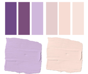
The look:
Calming, serene, cozy
This delicate combo gives off a soft, almost ethereal glow that adds a sense of peace and lightness to the space.
Yes, it leans a bit feminine, but with deeper tones and the right color accents, any male will feel comfortable.
Perfect for:
Classy spas and salons, boutique hotels, healthcare facilities
Dark Gray + Golden Bronze
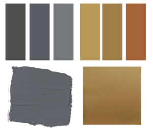
The look:
Warm, elegant, sophisticated
These two may not seem made for each other…until you see them together. This inky gray is a step up from the grays you’ve been seeing everywhere, and the gold tones transport it into the new decade.
Perfect for:
Lobbies, upscale restaurants
Black + White
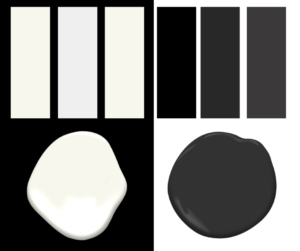
The look:
Luxurious, statement, timeless
Think zebras — or Sephora. Whether subtle or striking, this enduring color contrast never falls out of fashion.
Perfect for:
Offices and retail spaces of bold, indulgent brands
Navy + Cream
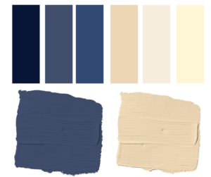
The look:
Classic, bold, masculine
Toasty cream warms up the cool navy, but the vivid contrast makes for a sharp finish, lending an empowering feel to the space.
Perfect for:
Corporate offices, game rooms, men’s clubs
Hunter Green + Greige
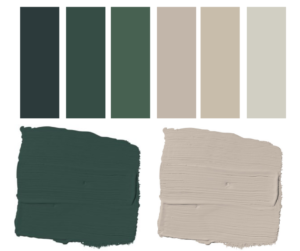
The look:
Trendy, warm, welcoming
This soothing natural shade — reminiscent of luscious forests — can run on the dark side. That’s why it’s paired with ever-popular greige, which softens and lightens the richness of hunter green.
Perfect for:
Break room, library, houses of worship